Sample Sidebar Module

This is a sample module published to the sidebar_top position, using the -sidebar module class suffix. There is also a sidebar_bottom position below the menu.

Sample Sidebar Module

This is a sample module published to the sidebar_bottom position, using the -sidebar module class suffix. There is also a sidebar_top position below the search.
Home

Search Our Site

Technology Meets Design

The Brand New Android LG Nexus Lorem ipsum dolor sit amet, consectetur adipiscing elit. Sed a massa sapien. Praesent non sem vitae tortor ornare dictum id sed eros. Morbi vehicula luctus finibus aliquet sed metus commodo, tempor hendrerit accumsan.

Read More

Fully Responsive Design

This Template Is Fully Responsive - Resize Your Screen To See It In Action Read More

New Smart Watches

The Latest Smartwear Is Looking Great Lorem ipsum dolor sit amet, consectetur adipiscing elit. Sed a massa sapien. Praesent non sem vitae tortor ornare dictum id sed eros. Morbi vehicula luctus finibus aliquet sed metus commodo, tempor hendrerit accumsan.

Read More
  • Best Rated Customer Service

    Lorem ipsum dolor sit amet, consectetur adipiscing elit. Integer et laoreet metus. Lorem ipsum alet amet integer leas singe lorem aenean quis molli.
  • Free Delivery On Large Orders

    Quisque tristique auctor accumsan. Nulla luctus, quam ac gravida ultricies, tortor diam euismod velit, non venenatis est turpis eu magna.
  • Start of the Art Cloud Services

    In hac habitasse platea dictumst. In rutrum dui nisi. Fusce at porta ipsum. Mauris erat erat, vestibulum vestibulum consectetur eget, suscipit non sapient.
Register

Latest Tech News

Devices

It's Time To Consolidate Devices

Class aptent taciti sociosqu ad litora torquent per conubia nostra, per inceptos himenaeos. Quisque tristique eros nec sodales consequat. Cras pretium aliquam malesuada. Etiam a consectetur lorem, at commodo magna. Pellentesque iaculis dapibus augue et porta.

Devices

What Comes After The Tablet?

Suspendisse ornare nulla sit amet ex mattis aliquam. In orci arcu, consectetur sit amet vestibulum quis, pretium quis risus. Sed ultrices massa velit, nec convallis augue faucibus eget. Suspendisse potenti. Vivamus enim nulla, consequat et ipsum nec, sollicitudin dolor.
Devices

How To Find An App Developer

Vivamus consequat tellus at tincidunt maximus. Suspendisse tristique, orci vel feugiat luctus, mi libero tempor diam, non vestibulum ante eros consectetur mi. Nulla lacinia mauris odio, non sagittis est tempor et. Morbi viverra a nisl at maximus. Etiam accumsan aliquet tellus.
Technology

Free Music Streaming Apps

lass aptent taciti sociosqu ad litora torquent per conubia nostra, per inceptos himenaeos. Quisque tristique eros nec sodales consequat. Cras pretium aliquam malesuada. Nullam ultrices turpis eget leo tempor lobortis. Fusce ac lorem quis odio malesuada euismod.
Devices

Small Device With Large Sound

Proin finibus magna accumsan metus dictum, eu rutrum nibh porttitor. Proin nec magna id lacus lacinia tristique. Aliquam volutpat egestas nibh. Phasellus enim ante, aliquam ut ultrices imperdiet, vestibulum eget lorem. Nunc sollicitudin ullamcorper lorem ipsum dapibus.
Technology

Apps That You Will Need

Praesent eu sapien lacus. Aenean porta lacus at egestas finibus. Phasellus viverra elementum mi, sit amet faucibus lectus rutrum sit amet. Morbi nisi id ullamcorper feugiat, arcu nisl consequat leo, non ultrices mi est in lectus condimentum magna nec justo facilisis.
Smartwear

Smart Watches With Great Design

Nulla lacinia mauris odio, non sagittis est tempor et. Morbi viverra a nisl at maximus. Etiam accumsan aliquet tellus, aliquet volutpat tortor ornare non. Mauris laoreet diam vitae nibh congue, in vehicula arcu efficitur. Fusce laoreet ornare erat, eu vehicula justo vulputate in.
Technology

The New Smart Light Bulbs

Curabitur neque libero, interdum eget posuere ac, tincidunt non mauris. Sed porta ut libero et sollicitudin. Donec sagittis mauris at neque malesuada, in nisi id ullamcorper feugiat, arcu nisl consequat leo, non lorem ipsum ele ate ultrices mi est in lectus dignissim sem consequat.

SEO - Get your site noticed!

Not only is this template beautifully designed but it is great for search engine optimization as well! What is SEO? It is simple the act of altering a web site so that it does well in the organic, crawler-based listings of search engines such as google.com. How does this template accomplish this? It's simple, the majority of your most valuable content is found in the main body of your site, through css we are able to alter the layout of the site and call the main content before the left and right columns are called. This allows for your content to be found first by search engines before it reaches your other content, which is vital in search engine optimization. This is a common feature this can be done with almost all of Shape 5 templates as well.


I like what I see! I want to JOIN TODAY.
The S5 Tab Show can be demo'd on this page. The styling of the module shown here is customized specifically for this template with css overrides, and cannot be used with any other template. The same module can be used on any template, but with default or other styling in its place.

The S5 Tab Show will display up to 20 modules in various styles within sliding tabs, and is compatible with responsive sites. Simply publish the S5 Tab Show module to your desired module position and pages. Then start publishing modules to the positions in the Tab Show (s5_tab1, s5_tab2, etc); these modules will become the slides. This is a great way to organize and showcase your site's content or images. Version 3 of this module is incredibly powerful, below is a list of all of its features.

  • Transitions are powered by CSS3, so no javascript conflicts
  • Optional custom classes
  • Up to 10 copies of the module on the same pages; each individually controlled
  • Use up to 20 slides
  • Select on mouseover or on click for activation
  • Set the loation of the tabs or arrows
  • Center the tabs or arrows
  • Hide the tabs or arrows until mouseover
  • Force the tabs or arrows to be shown for tablets and mobile devices
  • Select your transition effect
  • Set your duration speed
  • Add extra padding in between slides or no padding at all
  • Optional button text for tabs
  • Optional images for tab buttons
  • Set a background color or image for each slide or the entire module
  • Enter pre-text and post-text
The S5 Flex Menu system is a very powerful plugin that provides functionality far beyond what the standard Joomla menu system can provide. This plugin is intended to be as an extension of the existing menu system in Joomla to add many new features! Please see the full list of features below.

This menu system works off of the core Joomla jquery/mootools scripts so no extra javascript library is needed and keep download sizes to a minimum. Also, if you do not want to use this menu you can simply turn it it off from the template configuration page.

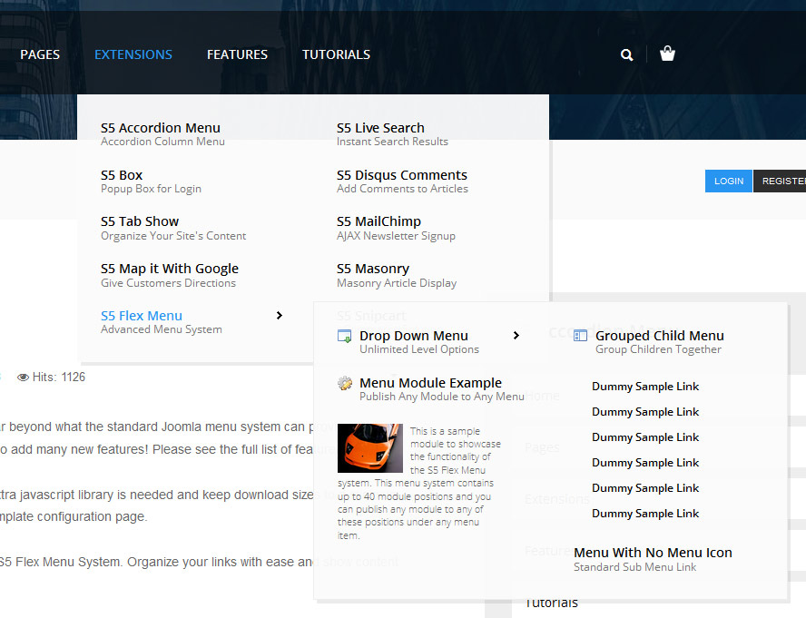
Take your website to the next design level by using the robust and feature rich S5 Flex Menu System. Organize your links with ease and show content in places you never could before!

Menu Features:

  • Automatic onclick functionality for tablet sized touch screens. If a device's screen is detected as touch screen and is of table size, then the menu will function with an onclick method rather than the onmouseover effect that is shown on a laptop or desktop that has a mouse for use.
  • Multiple javascript effects such as fade, slide, etc.
  • Multiple columns for menu items or modules.
  • Modules load directly into the menu.
  • Group sub menu items into the same column or fly out.
  • Optional sub texts for each menu item.
  • Optional menu icon images for each menu item.
  • Automatic multi-language menu change. If you are setting up a multi-language site, the flex menu will automatically change if your site's visitor has a language specific menu setup for their language in the menu manager.
  • And much more!


Menu Screenshot:


I like what I see! I want to JOIN TODAY.

iPad Ultimate Collection

Lorem ipsum dolor sit amet, consectetur adipiscing elit. Mauris placerat iaculis dignissim. Nunc dictum lectus quam, eget congue augue varius nec. Praesent iaculis dapibus ligula.
Read More

Nikon D-Series $599

Nulla interdum mi in nulla varius, non consequat odio facilisis. Nullam in blandit tellus. Nam dictum, orci vel aliquam aliquet, nec.
Buy Now
Smartwear
Phones
Tablets

New Sony Versa Watch

$149.99

Microsoft Xteria Watch White

$99.99

Samsung Vanio Watch Blue

$179.99

Leather Band Android Watch

$249.99

LG Nexus Phone Refurb

$149.99

iPhone 6s With Siri

$299.99

Samsung Galaxy S7

$249.99

New HTC Desire 626

$129.99

Acer Transform Windows 10

$549.99

Apple iPad Air Mini

$299.99

Lenovo 7 Inch Charger

$179.99

Microsoft Surface Pro 3

$729.99

Stay Tuned

Be sure to also subscribe to our newsletter to received up to date news, announcements, and sales. No spam, just important information about our products and services.

Responsive Design Lorem ipsum dolor sit amet, consectetur adipiscing elit. Integer et laoreet metus. Lorem ipsum alet amet integer leas singe lorem aenean quis molli.
Dozens of Positions Nullam laoreet velit ut mi rutrum maximus. Vivamus nec augue quis lorem feugiat congue. Fusce id magna vitae turpis hendrerit aliquam congue quis.
Vertex4 Framework Lorem ipsum dolor sit amet, consectetur adipiscing elit. Integer et laoreet metus. Lorem ipsum alet amet integer leas singe lorem aenean quis molli.
Easy Configuration Lorem ipsum dolor sit amet, consectetur adipiscing elit. Integer et laoreet metus. Lorem ipsum alet amet integer leas singe lorem aenean quis molli.
Google Fonts Nullam laoreet velit ut mi rutrum maximus. Vivamus nec augue quis lorem feugiat congue. Fusce id magna vitae turpis hendrerit aliquam congue quis.
Custom Colors Lorem ipsum dolor sit amet, consectetur adipiscing elit. Integer et laoreet metus. Lorem ipsum alet amet integer leas singe lorem aenean quis molli.